How to Choose the Right Pedestrian Signs in 2026?

Choosing the right pedestrian signs in 2026 requires more than selecting a bright design. Signs must help people understand movement, hazards, and access conditions within seconds. A clear sign beside a school crossing can protect a child, while a confusing sign near a construction zone may create hesitation. Small details matter.

The best pedestrian signs combine visibility, readable symbols, durable materials, and suitable placement. Consider viewing distance, night lighting, weather exposure, traffic speed, and the needs of older adults or people with disabilities. Local authorities and safety professionals should review current standards before installation, because requirements can differ between locations. Real-world observation is equally valuable. Watch how people approach the sign, where they pause, and whether vehicles respond as expected.

Do not rely on appearance alone. A sign that looks modern may perform poorly in rain, glare, or crowded streets. Testing helps. So does maintenance. Faded colors, blocked sightlines, and damaged posts can reduce a sign’s value quickly. There is no universal solution. Even experienced planners can overlook an unusual pedestrian route or an unexpected nighttime condition. That is why selection should include site assessment, user feedback, and periodic review. The goal is simple: give every person enough clear information to move safely and confidently.

How to Choose the Right Pedestrian Signs in 2026?

Define the Purpose and Location of Pedestrian Signs

How to Choose the Right Pedestrian Signs in 2026?

Define the purpose before selecting a pedestrian sign. Is it warning drivers, directing walkers, marking a crossing, or controlling access? Each purpose requires different wording, symbols, placement, and visibility.

The 2023 WHO Global Status Report on Road Safety estimates 1.19 million annual road deaths worldwide. More than half involve vulnerable road users, including pedestrians, cyclists, and motorcyclists. Clear communication matters.

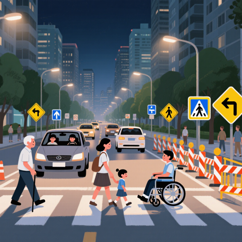
Location should reflect real decisions, not simply available space. Place a crossing warning before the point where drivers can still slow safely. At a school entrance, the sign should face approaching traffic, remain above parked vehicles, and stay visible near dusk. At a parking exit, drivers may need a pedestrian warning before the sidewalk, not beside it.

The 11th Edition of the Manual on Uniform Traffic Control Devices, published by the U.S. Federal Highway Administration in 2023, emphasizes consistent application, visibility, and engineering judgment for traffic signs.

Walk the site at different times. Observe turning vehicles, blocked sightlines, shadows, weather, and pedestrian movement. A technically correct location can still perform poorly.

I have found that sign height alone does not solve visibility problems. Sometimes the better answer is moving the sign several metres, improving lighting, or adding a second sign at a decision point. That choice may feel excessive. It may also prevent a driver from noticing the crossing too late.

Recheck the location after installation, because traffic patterns change.

Identify Applicable Safety Standards and Legal Requirements

How to Choose the Right Pedestrian Signs in 2026?

Legal compliance should guide every pedestrian-sign decision. In the United States, the FHWA’s Manual on Uniform Traffic Control Devices, 11th Edition, defines sign shapes, colors, symbols, placement, and maintenance expectations. Other countries may follow ISO 7010 symbols or national road standards. ISO guidance improves recognition, but it does not automatically make a sign legally valid. Check municipal adoption rules before installation.

The need is measurable. NHTSA’s Traffic Safety Facts 2022 reported 7,522 pedestrian deaths in the United States.

A sign cannot replace a safe crossing design. It must support visibility, driver response time, accessibility, and nighttime recognition. Review mounting height, viewing distance, contrast, lighting, and obstruction risks. ADA requirements may also affect accessible routes, crossing controls, and tactile information. Requirements differ by site. That detail is easy to miss.

Tips:

Ask the traffic authority for written approval before ordering signs. Compare the proposed symbol with the current local standard. Photograph the sign from a driver’s viewpoint, including rain and darkness. Retroreflective sheeting can help, but it is not magic. Trees, glare, and poor placement can still weaken performance. Keep inspection records, replacement dates, and maintenance notes. A sign may look correct on paper and fail in real traffic. Recheck it after installation.

Compare Sign Types, Symbols, Colors, and Materials

How to Choose the Right Pedestrian Signs in 2026?

Pedestrian signs must communicate within seconds, often beside moving traffic, glare, and rain. The need is serious. WHO’s Global Status Report on Road Safety 2023 estimates 1.19 million annual road deaths worldwide. In the United States, NHTSA’s Traffic Safety Facts 2022 recorded 7,522 pedestrian fatalities. These figures support clearer sign decisions, not merely larger signs.

Use a walking-person symbol when recognition speed matters. Add a directional arrow near crossings, school entrances, or shared paths. Text can clarify unusual conditions, but crowded wording weakens attention. Yellow-green backgrounds offer strong daytime conspicuity, while standard yellow remains widely understood for warnings. White symbols and black borders usually create useful contrast. Still, color alone is unreliable at night.

Material choice should match exposure and maintenance capacity. Aluminum signs resist corrosion and remain practical for outdoor mounting. Retroreflective sheeting helps headlights return the message toward drivers. FHWA’s Manual on Uniform Traffic Control Devices, 11th Edition, emphasizes consistent sign design, placement, and visibility. ASTM D4956 classifications also separate retroreflective performance levels for different traffic conditions. Higher performance is not automatically better. It may exceed the site’s real needs and budget.

I would inspect the sign at driver height, after sunset, during rain, and from a side approach. That judgment can be wrong. Trees, parked vehicles, and wet pavement may change visibility completely. A symbol that looks obvious in a drawing can become confusing beside a busy curb. Use field observations, maintenance records, and local requirements before selecting color, symbol, size, or material.

How to Choose the Right Pedestrian Signs in 2026? - Compare Sign Types, Symbols, Colors, and Materials

Selection guide based on commonly used traffic-sign conventions. Local road authorities and national standards should always be checked before installation.
Sign Type Primary Use Typical Symbol or Legend Common Color Scheme Typical Shape Recommended Material Best Placement Visibility and Selection Notes
Regulatory Pedestrian Crossing Sign Indicates a legally designated pedestrian crossing and supports driver compliance. Pedestrian crossing symbol, zebra-crossing symbol, or a clear “CROSSWALK” legend. White legend or symbol on a contrasting regulatory background; exact colors depend on the applicable road standard. Usually rectangular or square. Aluminum sign panel with retroreflective sheeting for outdoor durability and nighttime recognition. At or near the crossing, positioned where approaching drivers can see it before the stopping area. Use a standardized symbol rather than a custom illustration. Avoid placing the sign behind trees, parked vehicles, or street furniture.
Pedestrian Crossing Warning Sign Warns motorists that pedestrians may enter or cross the roadway ahead. Walking person, crossing figure, or two-person pedestrian symbol. Fluorescent yellow-green or yellow backgrounds are commonly used for enhanced conspicuity; black symbols are typical. Diamond in many warning-sign systems; triangular warning signs are used in several other systems. High-intensity or microprismatic retroreflective sheeting on aluminum. Before the crossing at a distance that allows drivers to perceive, react, and slow down. Choose fluorescent yellow-green where pedestrian activity is high, especially near schools, transit stops, or complex backgrounds.
School Zone or School Crossing Sign Identifies an area with frequent child pedestrians and supports reduced-speed driving. Children walking, schoolhouse, “SCHOOL,” or “SCHOOL CROSSING.” Fluorescent yellow-green is widely used for school-related pedestrian warnings; black symbols or text provide contrast. Diamond or rectangular supplemental panel, depending on the message. Aluminum with durable fluorescent retroreflective sheeting; add an electronic beacon only where permitted and justified. At the beginning of the school zone and before school crossings, entrances, or pickup areas. Use short wording, large symbols, and consistent placement. Verify whether time-of-day panels or flashing devices are authorized locally.
Shared-Use Path Sign Identifies a route used by pedestrians, cyclists, and sometimes other non-motorized users. Walking person and bicycle symbols, either combined or separated by a dividing line. White symbols on a green, blue, or locally standardized informational background. Usually rectangular or square. Powder-coated aluminum or aluminum with reflective graphics; flexible signs may be used for temporary path management. At path entrances, intersections, route changes, and locations where users need confirmation. Use separate-direction symbols or pavement markings when pedestrians and cyclists are divided into different operating spaces.
Pedestrian and Bicycle Prohibition Sign Restricts specific users from entering a road, lane, bridge, or facility. Pedestrian or bicycle symbol crossed by a diagonal bar or enclosed by a prohibition symbol. White field with a red prohibition ring or diagonal bar and a black user symbol in many international systems. Circular in many regulatory systems. Reflective aluminum panel or rigid polymer panel where impact resistance is important. At every practical access point to the restricted area and at decision points before entry. Do not rely on text alone. Pair the sign with a physical barrier, route information, or an alternative path when appropriate.
Accessible Route or Facility Sign Directs users to accessible entrances, ramps, crossings, toilets, or pedestrian routes. International wheelchair symbol, directional arrow, and concise accessibility legend. High-contrast white symbol on blue is widely recognized; exact color requirements vary by jurisdiction. Square or rectangular. Aluminum, rigid PVC, or high-density polymer with UV-resistant printed or reflective graphics. At entrances, route junctions, level changes, and locations where the accessible route differs from the main route. Maintain clear sightlines and mount the sign where it can be read without blocking the accessible path or creating a protruding hazard.
Pedestrian Signal or Crossing Beacon Sign Identifies a signal-controlled crossing or a crossing supported by a pedestrian-activated beacon. Walking person, signal head, beacon icon, or a “PUSH BUTTON” instruction panel. Warning colors such as yellow or fluorescent yellow-green are common; regulatory and instructional panels use locally prescribed colors. Diamond for advance warning or rectangular for operating instructions. Weather-resistant aluminum with retroreflective sheeting; electronic components require sealed, corrosion-resistant housings. Before the crossing and beside the pedestrian push button or signal equipment, without obstructing wheelchair access. Use supplementary signs only when they clarify operation. Keep instructions brief and provide tactile or audible information where required.
Temporary Pedestrian Detour Sign Guides pedestrians safely around construction, closures, maintenance, or event-related obstructions. Walking person, directional arrow, “SIDEWALK CLOSED,” or “PEDESTRIAN DETOUR.” Orange is commonly used for temporary work-zone traffic control, with black symbols or text. Rectangular; arrow panels may be horizontal or vertical according to the route. Lightweight aluminum, corrugated plastic, or roll-up reflective material secured to a stable support. At the closure, before every decision point, and repeatedly along the complete detour route. The detour must remain continuous, well-lit, accessible, and free of trip hazards. Remove temporary signs when the restriction ends.
Pedestrian Destination or Wayfinding Sign Helps pedestrians find transit stops, public facilities, parks, crossings, districts, and other destinations. Destination name, walking symbol, directional arrow, distance, or estimated walking time. High-contrast informational colors such as white on dark green, blue, or charcoal; the local wayfinding system determines the final palette. Rectangular or blade-style directional panel. Powder-coated aluminum, stainless-steel components, or UV-stable polymer graphics for long-term outdoor use. At plazas, intersections, transit connections, and route choices where pedestrians need advance direction. Use consistent typography, arrows, and naming. Keep text short and maintain readable contrast in daylight and at night.
Material and performance checklist: Select corrosion-resistant panels, UV-stable finishes, rounded or protected edges, tamper-resistant fasteners, and retroreflective surfaces where nighttime visibility is required. Confirm sign size, mounting height, setback, color, symbol design, and accessibility requirements with the governing road authority before production.

Evaluate Visibility, Accessibility, Durability, and Maintenance

How to Choose the Right Pedestrian Signs in 2026?

A pedestrian sign must remain readable at a distance, in daylight, rain, and low light. I recommend checking visibility from a driver’s eye level, not only from the installation point. High-contrast colors, clear symbols, and matte surfaces can reduce glare. Test the sign from several angles. A design that looks excellent indoors may disappear beside wet pavement.

Accessibility requires more than large lettering. Use simple symbols, readable type, suitable mounting height, and strong contrast for people with limited vision. Consider wheelchair users, children, older pedestrians, and people moving quickly through busy crossings. Confirm the design against current local accessibility requirements. Small details matter. A crowded sign can confuse everyone.

Durability affects safety and long-term cost. Select materials that resist ultraviolet exposure, moisture, corrosion, and repeated cleaning. Inspect fasteners and posts, especially after storms or roadwork. Create a maintenance schedule with monthly visual checks and deeper inspections every few months. Record fading, cracks, loose hardware, and blocked sightlines. In my field experience, neglected obstructions often cause more trouble than weak sign materials. That lesson is easy to overlook. A perfect maintenance plan is unrealistic, so teams should document missed inspections and adjust the schedule honestly. Test visibility again after repairs, landscaping changes, or nearby construction.

Select, Install, and Review the Most Suitable Signs

Choosing the right pedestrian signs in 2026 starts with observing real movement. Watch people cross, pause, turn, and hesitate near entrances. A school entrance needs different guidance from a shared parking lane. Select signs with clear symbols, strong contrast, and readable wording. Keep the message short. Drivers and pedestrians rarely study signs for long. Consider viewing distance, lighting, weather, and the height of different users. Local traffic authorities and accessibility guidance should inform the final selection.

Installation requires more than fixing a sign to a post. Place it where users naturally look, without blocking sidewalks, ramps, windows, or sightlines. Check the sign from a wheelchair, a child’s height, and a vehicle approaching at night. Use stable posts and suitable mounting hardware for local wind and surface conditions. Leave enough space around the sign. Crowded visual areas weaken even a well-designed message. I have seen signs installed correctly but hidden behind tree branches. The plan was sound; the site changed.

Review each sign after installation, then inspect it during different seasons. Look for fading, glare, dirt, loose fittings, and confusing nearby messages. Ask pedestrians what they understood before changing the layout. Record dates, photographs, reported problems, and completed repairs. This creates a useful maintenance history. Do not assume one inspection proves success. A sign may work on a sunny afternoon and fail during rain. My own early reviews focused too much on appearance. I now watch behavior longer, although some judgments still need a second opinion.